jQuery mobile framework takes the "write less, do more" mantra to the next level: Instead of writing unique apps for each mobile device or OS, the jQuery mobile framework will allow you to design a single highly branded and customized web application that will work on all popular smartphone and tablet platforms. Click here for more.
Basic features of jQuery Mobile include:
General simplicity
The framework is simple to use. You can develop pages mainly using markup driven with minimal or no JavaScript.
Progressive enhancement and graceful degradation
While jQuery Mobile leverages the latest HTML5, CSS3, and JavaScript, not all mobile devices provide such support. jQuery Mobile philosophy is to support both high-end and less capable devices, such as those without JavaScript support, and still provide the best possible experience.
Accessibility
jQuery Mobile is designed with accessibility in mind. It has support for Accessible Rich Internet Applications (WAI-ARIA) to help make web pages accessible for visitors with disabilities using assistive technologies.
Small size
The overall size of the jQuery Mobile framework is relatively small at 12KB for the JavaScript library, 6KB for the CSS, plus some icons.
Theming
The framework also provides a theme system that allows you to provide your own application styling.
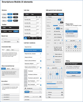
Some jQuery Mobile UI elements

But getting back to Adobe Creative Suite 5.5 Web Premium: with it, you can:
- Manage content for different screen sizes.
- Develop apps for virtually any mobile device.
- Ensure design integrity across the entire web.
For a look at this new flexibility, click here to watch Adobe's Dreamweaver CS 5.5 creating a rich app for Apple's iPad.
Stay tuned!